


In the business realm, efficiency and clarity are paramount, particularly when it comes to data presentation. While Excel offers a robust array of chart options, they often consume significant workspace as standalone entities.
Enter sparklines—a compact yet potent tool for conveying essential insights within individual cells. Throughout this tutorial, we’ll delve into the essence of sparklines, explore their diverse variations, and unveil strategic techniques for seamlessly incorporating these dynamic visualizations into your Excel workflows.
Stay tuned as we equip you with invaluable insights and strategies to master Excel sparklines, empowering you to elevate your professional presentations and captivate stakeholders with concise, impactful data representations. Let’s start on this journey to enhance your Excel proficiency and amplify your business acumen!
What are Sparklines in Excel?
Sparklines, a feature introduced by Microsoft in Excel 2010, are succinct visual representations encapsulated within a single cell. These miniature charts effectively convey trends and fluctuations in data, whether across time or categories.
By leveraging sparklines, you can distill complex information into easily digestible visuals, enabling audiences to swiftly grasp trends at the conclusion of a data row or column. Moreover, their compact nature conserves valuable space on Excel worksheets.
Below are notable scenarios where incorporating sparklines in Excel proves beneficial:
- Illustrating trends within datasets organized by rows or columns.
- Highlighting seasonal fluctuations in business metrics such as sales, inventories, and investments.
- Visualizing economic cycles within a region or country.
- Easily identifying minimum and maximum values within tabular datasets.
- In essence, sparklines find their application in datasets exhibiting variations over specific periods, offering a streamlined approach to data visualization within Excel.
In Microsoft Excel, you can leverage different types of sparklines to effectively visualize your data. Here’s a rundown of the sparkling types Excel offers:

- Column Sparklines: These are compact bar graphs seamlessly integrated within individual cells. They excel at illustrating data such as quarterly sales figures, market shares, or survey results.

- Win/Loss Sparklines: Also known as binary sparklines, Win/Loss Sparklines are simplistic bar charts where positive values ascend above the horizontal axis, while negative values descend below it. They’re ideal for representing binary outcomes or performance metrics.
- Line Sparklines: These miniature line charts provide a visual representation of data trends within a single cell over a specified data range. Whether showcasing trends in stock prices, sales figures, temperature fluctuations, or population dynamics, line sparklines offer insights into data patterns and variations.
Now that you’re acquainted with the different types of sparklines available in Excel, let’s explore various methods to insert them into your worksheets.
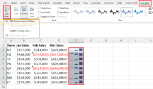
Add Excel Sparklines From the Insert Tab
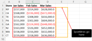
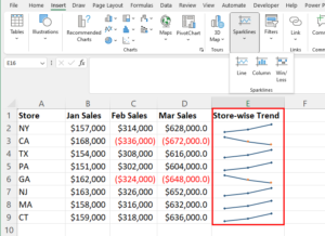
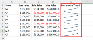
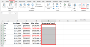
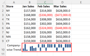
To seamlessly incorporate sparklines into your Excel worksheet, it’s crucial to begin by organizing your data effectively. Arrange your dataset in rows, such as A2:E2, allowing you to position the sparkline in F2 to visualize the preceding cell values.
Likewise, when incorporating sparklines into columns, ensure that the dataset starts from the top of the column. For example, if your dataset spans from B2:B10, position the sparkline in cell B11. Avoid including any text or blank cells in the dataset, as this may cause Excel to skip those spaces in the sparkline, potentially leading to a confusing visualization.
Once your dataset is organized as depicted in the screenshots provided, follow these steps to add sparklines:
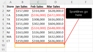
- Highlight the destination cell range where you want to generate the sparklines.
- Navigate to the Insert tab, and click on the type of sparkline you wish to insert from the Sparklines commands block.
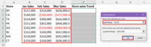
A Create Sparklines dialog will appear. Click on the Data Range field and select the input data for the sparklines.
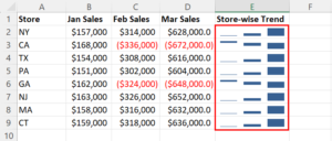
Excel will generate the sparklines instantly.
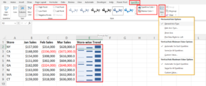
If you wish to edit various elements of the sparklines you’ve added, follow these steps:
Go to the Sparkline tab.
Here, you can modify the following:
- Sparklines Show: Activate or deactivate options such as High Point, First Point, Negative Points, and more.
- Sparklines Style: Choose from a variety of styles available in the box list.
- Sparkline Color and Marker Color: Customize the colors according to your preference using the drop-down menus.
- Axis: Customize Horizontal Axis and Vertical Axis configurations as needed.
If you prefer to add sparklines below the columns of the dataset, simply select the next row below the columns where your dataset ends as the destination for the sparklines. This straightforward process seamlessly integrates sparklines into your Excel worksheet for enhanced data visualization.
Create Sparklines in Excel using Quick Analysis
Here’s the quickest method to create sparklines within cells in Excel:
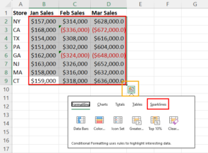
- Highlight the target dataset.
- Click on the Quick Analysis button located at the lower right corner of the highlighted table.
- A context menu will appear with multiple tabs. Navigate to the Sparklines tab.
- Choose the sparkling style you require by clicking on it.
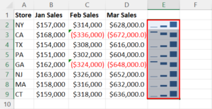
- Excel will add the sparkline group vertically, to the right side of the dataset.
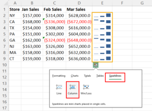
- To convert the vertical sparkline to a horizontal one, follow these steps:
- Go to the Sparkline tab.
- Click on the Edit Data drop-down.
- Select Edit Group Location & Data to open the Edit Sparklines dialog.
- Click on the Location Range field and highlight a horizontal cell range below the dataset.
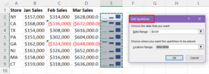
- Excel will automatically adjust the orientation and the input data range for the horizontal sparklines.
![]()
Add Excel Sparklines in Tables and PivotTables
Sparklines in Excel are also accessible within Excel Table and PivotTable objects.
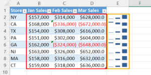
For instance, consider the example of a sparkline group created within an Excel table object. To accomplish this, simply select the destination for the in-cell charts and follow the steps outlined earlier in this article to add sparklines.
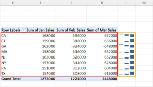
Similarly, the process remains consistent for incorporating sparklines with PivotTables. As depicted in the simple example of PivotTable sparklines provided above, you can seamlessly integrate sparklines by following the same procedure outlined previously.
Insider tips for Mastering Excel Sparklines
Here are some firsthand tips garnered from experience to help you refine your skills in creating sparklines in Excel:
- Select the appropriate type of sparkline based on your data and the narrative you wish to convey. Typically, opt for Line sparklines for depicting trends, Column sparklines for comparisons, and Win/Loss sparklines for simple up/down patterns in datasets.
- Be mindful that Excel disables the Sparklines block when opened in safe mode.
- Customize sparkline colors and styles to harmonize with your Excel theme, enhancing overall readability.
- Ensure clarity and understanding by paying attention to axis labels and data points.
- Position sparklines in close proximity to the corresponding data to facilitate easy comparison and analysis.
- Take care to manage how missing data is represented in sparklines to maintain accuracy.
- Adjust the axis range as needed to focus on pertinent data points.
- Incorporate markers to highlight highs, lows, or specific values within your sparklines, aiding in data interpretation.
- If your sparklines appear crowded, consider adjusting row heights and column widths to improve visibility and comprehension.
- Remember that sparklines essentially function as image layers on cells, allowing you to continue adding data into cells containing sparklines without interference.
Conclusion:
Take the next step in honing your Excel sparkline proficiency by engaging with one of the feasible methods you’ve encountered so far. Experimenting with these methods will provide you with valuable hands-on experience and insights into the nuances of sparkline creation. Choose a method that resonates with you, whether it’s inserting sparklines from the Insert tab, utilizing the Quick Analysis tool, or exploring other available options. Use this opportunity to delve deeper into the world of Excel sparklines and elevate your data visualization capabilities.
FAQs:
- What are Excel sparklines, and how do they enhance data visualization?
Excel sparklines are miniature charts embedded within individual cells, offering a condensed visual representation of data trends and variations. They enhance data visualization by providing quick insights into patterns and fluctuations without occupying significant space on the worksheet.
- Can I add sparklines in Excel using different methods, and if so, what are they?
Yes, you can add sparklines in Excel through various methods. Common approaches include using the Insert tab, Quick Analysis tool, or directly from the Sparklines commands block. Each method offers a convenient way to incorporate sparklines based on your preferences and workflow.
- Are there specific types of data best suited for Excel sparklines?
Excel sparklines are versatile and can be applied to various types of data. They are particularly effective for showcasing trends, comparisons, and patterns within datasets, making them suitable for tasks such as tracking sales trends, analyzing financial data, or monitoring progress over time.
- How can I customize sparklines in Excel to match my spreadsheet’s theme?
Excel offers customization options to tailor sparklines according to your spreadsheet’s theme. You can adjust sparkline colors, styles, axis labels, and markers to align with your desired aesthetics and improve readability for viewers.
- Is there a recommended placement for sparklines within Excel worksheets to maximize their effectiveness?
To maximize the effectiveness of sparklines, it’s advisable to place them close to the corresponding data for easy comparison and analysis. Positioning sparklines adjacent to the dataset they represent facilitates quick insights and enhances the overall clarity of the visualization.
